Придать немного динамики на сайт можно с помощью несложных hover-эффектов на CSS. Представленные ниже способы можно применять для превью в фотогалереях, на страницах портфолио и каталогах товаров.
Демонстрация всех эффектов / Скачать исходники
1. Движение вверх

Хорошо подходит для нескольких изображений, расположенных горизонтально. Используется CSS-transition.
.ex1 img{
    border: 5px solid #ccc;
    float: left;
    margin: 15px;
    -webkit-transition: margin 0.5s ease-out;
    -moz-transition: margin 0.5s ease-out;
    -o-transition: margin 0.5s ease-out;
}

.ex1 img:hover {
    margin-top: 2px;
}
2. Увеличение

Оригинальное изображение размеров 400 на 133 пикселя, но в "состоянии покоя" уменьшается до 300 на 100.
#container {
    width: 300px;
    margin: 0 auto;
}

#ex2 img{
    height: 100px;
    width: 300px;
Антивирусные программные модули "Лаборатории Касперского"    margin: 15px 0;
     -webkit-transition: all 1s ease;
    -moz-transition: all 1s ease;
    -o-transition: all 1s ease;
}

#ex2 img:hover {
    height: 133px;
    width: 400px;
    margin-left: -50px;
}
3. Появление текста

При помощи color: transparent и line-height: 0px текст скрывается до наведения курсора на изображения.
#ex3 {
    width: 730px;
    height: 133px;
    line-height: 0px;
    color: transparent;
    font-size: 50px;
    font-family: "HelveticaNeue-Light", "Helvetica Neue Light", "Helvetica Neue", Helvetica, Arial, sans-serif;
       font-weight: 300;
    text-transform: uppercase;
    -webkit-transition: all 0.5s ease;
    -moz-transition: all 0.5s ease;
    -o-transition: all 0.5s ease;
}

#ex3:hover {
    line-height: 133px;
    color: #575858;
}

#ex3 img{
    float: left;
    margin: 0 15px;
}
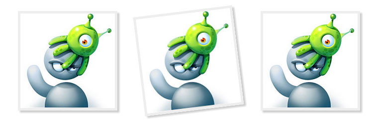
4. Поворот

При наведении превью просто немного поворачивается.
#ex4 {
    width: 800px;
    margin: 0 auto;
}

#ex4 img {
    margin: 20px;
    border: 5px solid #eee;
    -webkit-box-shadow: 4px 4px 4px rgba(0,0,0,0.2);
    -moz-box-shadow: 4px 4px 4px rgba(0,0,0,0.2);
    box-shadow: 4px 4px 4px rgba(0,0,0,0.2);
    -webkit-transition: all 0.5s ease-out;
    -moz-transition: all 0.5s ease;
    -o-transition: all 0.5s ease;
}

#ex4 img:hover {
    -webkit-transform: rotate(-7deg);
    -moz-transform: rotate(-7deg);
    -o-transform: rotate(-7deg);
}
5. Подсвечивание и отражение

Хорошо смотрится на темном фоне. Подробнее об отражении в CSS можно почитать в блоге David Walsh.
#ex5 {
    width: 700px;
    margin: 0 auto;
    min-height: 300px;
}

#ex5 img {
    margin: 25px;
    opacity: 0.8;
    border: 10px solid #eee;

    /*Transition*/
    -webkit-transition: all 0.5s ease;
    -moz-transition: all 0.5s ease;
    -o-transition: all 0.5s ease;

    /*Reflection*/
    -webkit-box-reflect: below 0px -webkit-gradient(linear, left top, left bottom, from(transparent), color-stop(.7, transparent), to(rgba(0,0,0,0.1)));
}


#ex5 img:hover {
   opacity: 1;

   /*Reflection*/
  -webkit-box-reflect: below 0px -webkit-gradient(linear, left top, left bottom, from(transparent), color-stop(.7, transparent), to(rgba(0,0,0,0.4)));

   /*Glow*/
  -webkit-box-shadow: 0px 0px 20px rgba(255,255,255,0.8);
  -moz-box-shadow: 0px 0px 20px rgba(255,255,255,0.8);
  box-shadow: 0px 0px 20px rgba(255,255,255,0.8);
}
Следующие примеры меньше подходят для применения на живых сайтах, однако их реализация интересна. К сожалению, решения совсем не кроссбраузерные, лучше всего отображаются в webkit-браузерах.
6. Увеличение

.grow img {
  height: 300px;
  width: 300px;

  -webkit-transition: all 1s ease;
     -moz-transition: all 1s ease;
       -o-transition: all 1s ease;
      -ms-transition: all 1s ease;
          transition: all 1s ease;
}

.grow img:hover {
  width: 400px;
  height: 400px;
}
7. Уменьшение

.shrink img {
  height: 400px;
  width: 400px;

  -webkit-transition: all 1s ease;
     -moz-transition: all 1s ease;
       -o-transition: all 1s ease;
      -ms-transition: all 1s ease;
          transition: all 1s ease;
}

.shrink img:hover {
  width: 300px;
  height: 300px;
}
8. Обзор горизонтальный

.sidepan img {
  margin-left: 0px;
  -webkit-transition: margin 1s ease;
     -moz-transition: margin 1s ease;
       -o-transition: margin 1s ease;
      -ms-transition: margin 1s ease;
          transition: margin 1s ease;
}

.sidepan img:hover {
  margin-left: -200px;
}
9. Обзор вертикальный

.vertpan img {
  margin-top: 0px;
  -webkit-transition: margin 1s ease;
     -moz-transition: margin 1s ease;
       -o-transition: margin 1s ease;
      -ms-transition: margin 1s ease;
          transition: margin 1s ease;
}

.vertpan img:hover {
  margin-top: -200px;
}
10. Изменение угла

.tilt {
  -webkit-transition: all 0.5s ease;
     -moz-transition: all 0.5s ease;
       -o-transition: all 0.5s ease;
      -ms-transition: all 0.5s ease;
          transition: all 0.5s ease;
}

.tilt:hover {
  -webkit-transform: rotate(-10deg);
     -moz-transform: rotate(-10deg);
       -o-transform: rotate(-10deg);
      -ms-transform: rotate(-10deg);
          transform: rotate(-10deg);
}
11. Скругление

.morph {
  -webkit-transition: all 0.5s ease;
     -moz-transition: all 0.5s ease;
       -o-transition: all 0.5s ease;
      -ms-transition: all 0.5s ease;
          transition: all 0.5s ease;
}

.morph:hover {
  border-radius: 50%;
  -webkit-transform: rotate(360deg);
     -moz-transform: rotate(360deg);
       -o-transform: rotate(360deg);
      -ms-transform: rotate(360deg);
          transform: rotate(360deg);
}
12. Фокус

.focus {
  -webkit-transition: all 1s ease;
     -moz-transition: all 1s ease;
       -o-transition: all 1s ease;
      -ms-transition: all 1s ease;
          transition: all 1s ease;
}

.focus:hover {
  border: 70px solid #000;
  border-radius: 50%;
}
13. Размытие

.blur img {
  -webkit-transition: all 1s ease;
     -moz-transition: all 1s ease;
       -o-transition: all 1s ease;
      -ms-transition: all 1s ease;
          transition: all 1s ease;
}

.blur img:hover {
  -webkit-filter: blur(5px);
}
14. Черно-белое

.bw {
  -webkit-transition: all 1s ease;
     -moz-transition: all 1s ease;
       -o-transition: all 1s ease;
      -ms-transition: all 1s ease;
          transition: all 1s ease;
}

.bw:hover {
  -webkit-filter: grayscale(100%);
}
15. Яркость

.brighten img {
  -webkit-filter: brightness(-65%);
  -webkit-transition: all 1s ease;
     -moz-transition: all 1s ease;
       -o-transition: all 1s ease;
      -ms-transition: all 1s ease;
          transition: all 1s ease;
}

.brighten img:hover {
  -webkit-filter: brightness(0%);
}