Tool Mentor: Reporting Defect Trends and Status
Purpose
This tool mentor tells how to create a ClearQuest chart to view defect trends and to generate a defect status report.
Rational Unified Process Related Activities: Report Defect Data and Evaluate Test.
Overview
This Tool Mentor is applicable when running Windows NT 4.0.
ClearQuest provides pre-defined charts and reports that allow you to see the status of your project at a glance. It's easy to modify charts and reports and to create your own.
ClearQuest charts display change request data graphically: distribution charts show the current status of data;trend, or aging, charts show historical information.
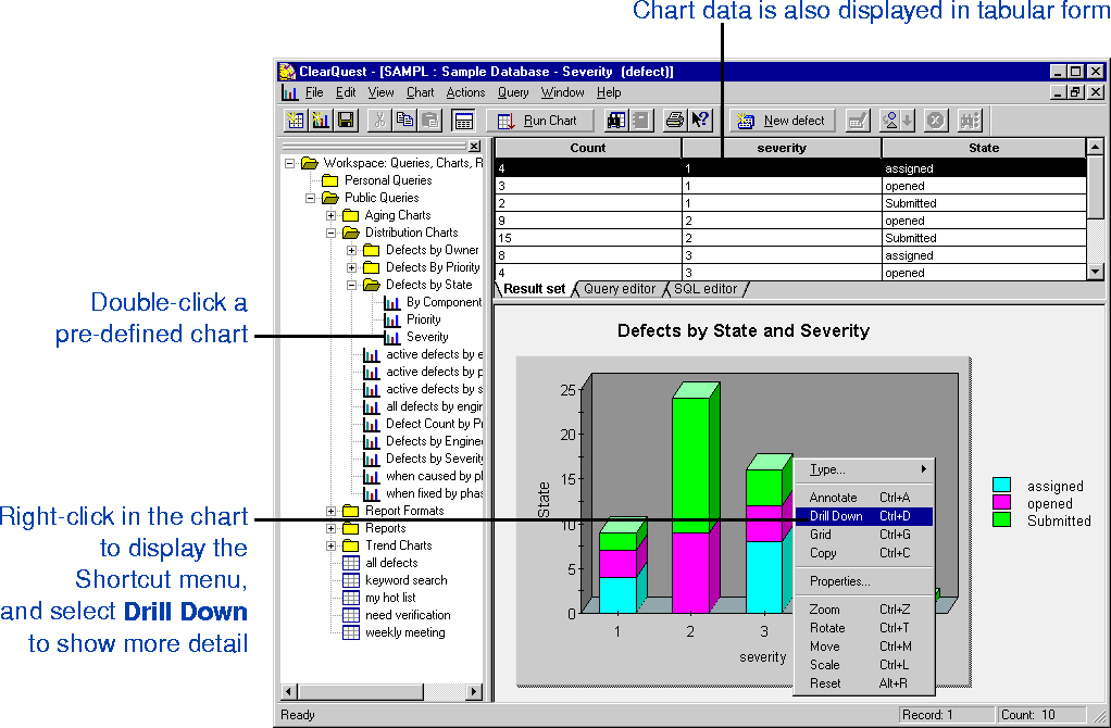
Distribution charts are used to measure how many records fall into defined categories or match the values you indicate. For example, use a distribution chart to see the current status of a group of records, or see who has been assigned the most/least change requests. Another example is a chart that details which records have the highest priority.
Trend charts show how many records were transitioned into the selected states by day, week or month. In other words, they show you the rate at which new records are being submitted, resolved or moved into other states.
Aging charts show how many records have been in the selected states for how long. Use aging charts to answers the questions: "How many defects have been open for one week? For two weeks? For three weeks?"
Because aging and trend charts help you track the history of a record’s state-transitions, only state-based records can be used to create aging and trend charts. That is, aging and trend charts won’t be helpful in tracking records that don’t have states.
Using reports
In addition, ClearQuest allows you to generate reports based on existing queries. A ClearQuest report consists of two parts: a query and a report format created by your third-party tool.
Once you have created a report format, you can save it in the Workspace to use with the queries. When you create a report in ClearQuest, you first choose a report format to use, then select a query to "plug in" to the report format.
Reports are stored in the Workspace, and can be run at any time. You can also generate a report for the active query, by choosing Query > Generate Report.
Tool Steps for Creating a Chart
You can use the ClearQuest chart wizard to create a distribution chart, a trend chart, or an aging chart.
To create a chart:
- Chose Query > New Chart or click
 on the toolbar.
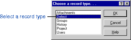
 - Select the record type that you want to chart, and then click OK.
- Under Chart Type, click the type of chart you want to create, and then click Next.
- Mark the Run Query check box if you want to run a query when you create the chart. When Run Query is marked, your chart will include all records. To filter your chart results, use the Query editor tab.
- If you leave the Run Query check box unmarked, the chart results will be empty until you define which records you want to chart, using the Query editor tab.
- Specify the parameters for the chart type (distribution, trend, or aging), and then click Next.
Specifying parameters for a distribution chart,
- To display a complete list of fields in the lists (instead of the default set you've defined as your favorites), select the Show All Fields check box.
- Under Vertical Axis (Y):
- In the Field list, click the field to use on the chart's y-axis. On the y-axis, you can only use a field with numeric values.
In the Function list, click the function to use on the y-axis.
- Under Horizontal Axis (X):
- In the field list, chose a field to use on the chart's x-axis.
In the Sort list, select how to sort the x-axis. To leave the x-axis unsorted, leave the field blank.
- For each legend you want to specify, do the following under Legends:
- In the Field list, chose a field to use as a legend.
In the Sort list, select how to sort the legend. To leave the legend unsorted, leave the field blank. Next
Specifying parameters for a trend chart,
Two key aspects of defining trend charts are the time intervals you choose, and which trend options you use.
The trend options are: Show state transitions in each time period, Show cumulative counts, and Show totals in each time period.
| Show state transitions in each time period | When Show state transitions for each time period is marked, your
chart will show how many records were transitioned into the given states during each time
period. A slow month will have a low number; a busy month will have a high number. In conjunction, check the Show cumulative counts check box to see the build up of the indicated states over the selected time periods. For example, a record submitted in March will be counted once in the Submitted category from March on, even after it is resolved. |
| Show cumulative counts | Use the Show cumulative counts in conjunction with Show state
transitions for each time period to see the build up of the indicated states over the
selected time periods. When Show cumulative counts is marked, the chart displays all
records that have ever been in the selected state. For example, a record submitted in March will be counted once in the Submitted category from March on, even after it is resolved. |
| Show totals in each time period | Click Show totals in each time period to see how many defects
are in a given state during that period. Showing totals can help you measure how fast
defects are being resolved or how long they remain in a given state. For example, a record submitted in March will be counted as in the Submitted category until it has been moved to another state. |
- Enter the start and end dates for the horizontal axis. Either click the button labeled to select a date on the pop-up calendar, or type in the date in MMDDYY format.
- In the Interval list, click the interval by which you want to graph the chart data.
- Click Select States, and then select the states you want to list in the chart legend.
- To choose a second legend:
- In the Field 2 list, click the field to use as the legend. To display a complete list of fields in the list (instead of the default set you've defined as your favorites), select the Show All Fields check box.
In the Sort list, select how to sort the legend. To leave the legend unsorted, leave the field blank.
- Click whether to show the state transitions that occurred in each interval or to show the totals in each time period.
- If you chose to show state transitions in step 5 and want to show the accumulated totals for each time period, select the Show cumulative counts check box. This feature helps to show how many state transitions also existed in previous time periods. Next
Specifying parameters for an aging chart,
- Define the interval you want to measure:
- In the Interval Size lists, click the number and the type of interval. For example, to
define a 2-week interval size, click 2 and then click Week.
In the Number of Intervals list, click the number of intervals you want in the chart.
- Enter an end date. Either click the button labeled to select a date on the pop-up calendar, or type in the date in MMDDYY format. ClearQuest measures all change requests entered before this date.
- Click Select States, and then select the states you want to list in the chart legend.
- To choose a second legend:
- In the Field 2 list, click the field to use as the legend. To display a complete list of
fields in the list (instead of the default set you've defined as your favorites), select
the Show All Fields check box.
In the Sort list, select how to sort the legend. To leave the legend unsorted, leave the field blank. Next
- Define the labels for the chart, and then click Next.
- Choose the type of display you want to use for the chart, and then click Next.
- Customize how your chart will appear by selecting the check boxes for the styles you want to include in your chart.
- Click Finish to compile the chart.
- After you create the chart, you can use the Query editor to filter the chart results.
Tool Steps for Creating a ClearQuest Report
A ClearQuest report consists of two parts: a query and a report format created by your third-party tool.
Once you have created a report format, you can save it in the Workspace to use with the queries. When you create a report in ClearQuest, you first choose a report format to use, then select a query to "plug in" to the report format.
Reports are stored in the Workspace, and can be run at any time. You can also generate a report for the active query, by choosing Query > Generate Report.
- Create a report format.
- Create a report.
You can a create report format by selecting the ClearQuest fields you want to include and then authoring the report format in a third-party report-authoring tool.
Create a report format
- Choose Query > New Report Format.
- Click the record type for which you want to create a report format, and then click OK.
- For each field you want to include in the report format, click it in the Select fields Available for Report list, and then click Add.
- Click Author Report.
- Author your report format in your third-party tool
- In the Edit Report Format dialog, click OK.
- ClearQuest asks you to confirm the report format edits.
- Click OK
The report format is listed in the Workspace.
Note:
Your report-authoring tool must be available when you create a report format.
Create a Report
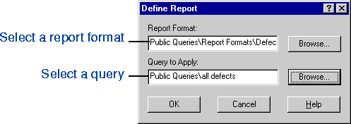
You can create a report by applying an existing query to an existing report format, and then running the report.
- Choose Query > New Report.
- Click the record type for which you want to create a report, and then click OK.
- Enter the name of the report format you want to use. Click Browse to find, or type in the name in the format: //foldername/reportformatname.
- Enter the name of the query to "plug in" to the report format. Click Browse to find, or type in the name in the format: //foldername/queryname.
- Click OK. The new report is run and displayed in the right pane.
![]()