Guidelines: User Interface (General)
 User Interface |
|
Topics
- Window Fundamentals: Setting the Context
- Visual Dimensions
- Power Find and Select
- Sorting
- User-Controlled Inheritance
- Browsing Hierarchies
- Window Management
- Session Information
- Online Help
- Undo
- Macro Agent
- Dynamic Highlighting
Window Fundamentals: Setting the
Context 
This section gives an overview of the anatomy of a window-based user interface. This overview is necessary to understand the rest of these guidelines.
A window-based user interface is divided into windows. Windows can be moved around the screen, stacked on top of each other, and iconified. A system usually has one primary window, and a number of secondary windows. The primary window handles the major interaction with the user, and often contains an arbitrary number of objects. Secondary windows are used to support the interactions with primary windows by providing details about their objects and operations on those objects.
Primary Windows
The primary window often contains an arbitrary number of objects with which the user interacts. The user typically interacts with the system by first selecting one or several objects, for example by clicking on them, and then choosing an operation (for example, via a menu) that is executed on all the selected objects. Common operations are Cut, Copy, Paste, Delete, and View Properties.
The primary window normally contains a menu bar, from which users can choose operations. Users can also choose operations through pop-up menus (by pressing the right mouse button on the object itself) and by direct manipulation (by clicking and dragging the object). Since the total number of objects may not fit within the primary window, users can often scroll through the objects using a scroll bar, or resize the window. In addition, the primary window can often be divided into panes (defining sub-areas of the window), that the user can also resize.
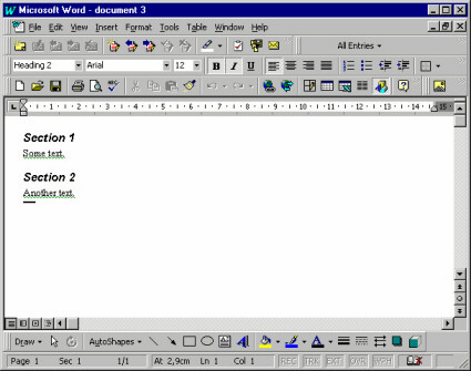
A primary window in Microsoft® Word™ 97, showing a document. It contains objects like paragraphs and characters. (Although the examples illustrated here are from the Microsoft® platform, these guidelines are by no means intended to be specific to that particular platform.)
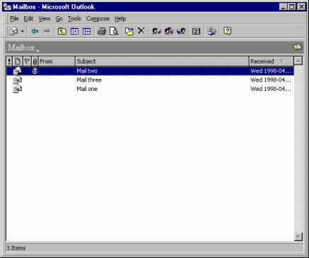
A primary window in Microsoft® Outlook, showing a mail box. It contains objects like mail messages.
Composites
A composite object in a user interface is an object that is visually composed of other objects. For example, a paragraph is a composite of characters, or a complex drawing object is a composite of more primitive drawing objects.
Secondary Windows
Secondary windows support the primary windows by providing details (such as properties) about their objects, and operations on those objects. Only a few of the objects' properties are normally shown in the primary window. Properties of an object can be viewed by opening a property window (which is a secondary window) that shows all the attributes of an object. The user can often change the attributes by controls such as toggle and radio buttons, scales, comboboxes, and text fields.
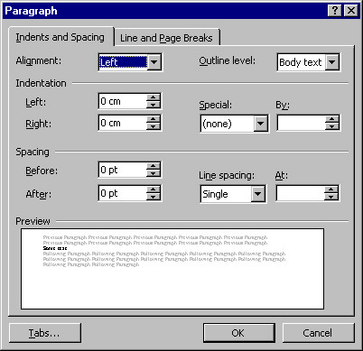
A secondary window in Microsoft® Word™ 97, which is a property window showing the properties of a paragraph.
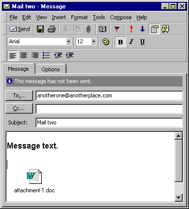
A property window in Microsoft® Outlook, showing the properties of a mail message.
Note that there is a fine, and sometimes quite artificial, line between primary windows and secondary windows-they may display the same levels of complexity. For example, compare the document window shown above with the mail window: the document window is considered primary, whereas the mail window is considered secondary.
However, two main differences between primary and secondary windows are:
- Primary windows are often considered to be more important to the application since they need to provide extensive usability. Therefore, development efforts tend to be more focused on the primary windows.
- Secondary windows are often displayed by navigating through primary windows, and not vice versa.
In addition to property windows, there are other types of secondary windows, such as dialog boxes, message boxes, palettes, and pop-up windows.
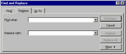
A dialog box in Microsoft® Word™ 97, providing a find operation among paragraphs and characters.
Many applications are filebased. Users can start these applications with the Open operation on a file object (for example, by double-clicking a file icon in a folder). Their primary window shows the objects stored in that file. Common operations on files are Save, Save As, Open, New, which can usually be selected through a file menu in the primary window. The primary window can also usually display multiple files (also called Multiple Document Interface, or MDI), thereby allowing the user to switch between different files.
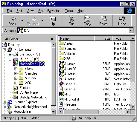
A file management window in Microsoft® Windows 95, showing files and folders.
Visual
Dimensions
The key to really usable primary windows is to use the visual dimensions when visualizing the contained objects and their attributes. The advantages of presenting more attributes than are necessary for identification are that:
- The user avoids window navigation overhead since you decrease the number of windows that must be shown (when the user needs to see an attribute that is presented in the primary window).
- The user can see the different aspects (of different objects) at the same time, which is often useful for comparisons and for starting to recognize patterns. A good use of the visual dimensions can encourage users to develop an entirely new fingertip feeling for their work.
The visual dimensions are:
These dimensions are presented below. However, beware of the available screen area when designing the visualization of the objects. Try to make the overhead when exploiting the screen area as small as possible, and consider if using several visual dimensions is worth the extra expenditure of screen area. Maybe the user is better served by just a list of names, because what the user really needs is to see as many objects as possible.
Note that it is important to use these visual dimensions, or extend them, to be able to uniquely identify objects. We also include a discussion on this subject below (see the section "Identification" below).
Also note that the visual dimensions can be used in correlation with the time dimension, for example by moving objects (their position is changed through time), or by changing the shape or color of objects (their state is changed through time); the latter case is discussed in the section "Shape" below.
Position
The most intuitive aspects that position can present is real-world positions. Examples are:
- Geographical Information Systems (GIS) that display a map on which you present the objects on the same longitude and latitude as they have in the real world;
- Computer Aided Design (CAD) programs that present the objects and their environment exactly according to their real-world coordinates;
- "What You See Is What You Get" (WYSIWYG) editors that display the objects (characters) in the same location on the window as they will appear on a paper printout.
Sometimes it is relevant to show real-world size (the CAD-program and WYSIWYG editor examples), and sometimes it is not (for example, when the size of the objects is much smaller than the distance between the objects).
For example, imagine we have a flightbooking system where the user must enter destinations. A possible presentation for this would be to display a map containing the different airports (where an airport is an object). Naturally, since the real-world sizes of the airports are irrelevant (as well as too small to be seen), all airports are shown as icons that are the same size.
This example also illustrates that real-world positions can be used even if they are not relevant, as long as they help the user to identify the objects. In the example, the user doesn't need to know the location of an airport. But, if the user is familiar with geography, it can be easier to find destinations on a map than in a list.
You can also use position to represent "virtual" real-world positions. For example, imagine a home shopping system where the users can buy things from different stores. A possible presentation for this would be to display a schematic picture of a (virtual) mall on which the different stores are positioned (where a store is an object). This schematic picture has nothing to do with the real locations of these stores-it only exploits the user's spatial memory: it is easier to remember an x-y position than it is to remember an item in a list or hierarchy.
Another alternative use for position is to show associations between objects: all objects that have the same vertical position are associated in one way, and all objects that have the same horizontal position are associated in another way. Spreadsheets are an example of this.
A similar alternative is to let one axis represent the value range of some attribute. For example, in a travel booking system, booked flights (where a flight is an object) could be presented along a horizontal time axis showing their relation in time, how long they will last, and the length of time the user will stay at each destination. These are all things that the user doesn't have to know, but they are nice to see if they can be presented unobtrusively.
If you don't want to use so much screen area by presenting the whole value range, you can collapse the distances between the objects. In the travel booking example, this would mean that all booked flights are laid out horizontally with no spaces in between, but the first flight is to the left, the second flight is immediately to the right of the first flight, and so on. Users wouldn't see the length of time they could stay at each destination, but they could see how long the flights would last.
Size
In many cases "size" must represent the same thing as position. In a CAD-system, for example, size must naturally represent real-world extent. Sometimes, however, we are free to choose what size should represent, for example the airports on the map that supported the destination selection.
In these cases, size should represent what is most intuitively perceived as the real-world size of the object. For a file, object size should represent amount of disk space occupied. For a bank account, object size should represent balance. For most sizes, a logarithmic scale is better than a proportional scale, since a proportional scale normally consumes too much screen area.
Size is actually so intuitive that you can consider showing it even if it is not relevant. After all, in the real world, different things (objects) occupy different proportions of our visual field because of their different size. And that is not obtrusive; it only helps us discriminate between the things. Similarly, using different sizes in the user interface will often help users discriminate between different objects.
Size should normally be used to present only one attribute, even though it would be possible to let horizontal extent present one attribute and vertical extent present another (which is rather non-intuitive, and might confuse the user).
Either horizontal extent or vertical extent should be (logarithmically) proportional to the attribute that size is to illustrate-the other extent should be fixed (or dependent on the length of the name, for example). If both horizontal and vertical extent is proportional to the same attribute, it seldom adds any value: it seems obtrusive and just consumes more screen area.
Shape
Shapes are normally represented by icons in a graphical user interface; shape is best used to represent type because it is more intuitive to map out a difference in looks than it is to map out a difference in type. In the real world, different objects of the same type of thing normally look similar, while objects of different types look different. For example, different objects of chair look similar (they all have four legs, a seat and a backrest), while a car looks very different from a chair.
So, what are the criteria for when different objects are of different types? Well, different classes should certainly be considered as different types. Also, some attributes are "type-like." These attributes must have a limited set of possible values and their value normally determines what can be done with the object (in terms of operations and possible values of other attributes). This is the same as in the real world-the most important difference between chair and car is how they are used: a chair is used for rest and a car is used for transportation.
However, when you analyze what should be considered different types, remember that the most important thing is: which attribute will the user most likely perceive as a type.
If you don't have multiple classes or any "type"-like attribute, you can use icons to represent the different values for some other limited-value attribute, but only if this attribute is of central interest to the user.
Icons are also often used to show different states of the object (in addition to showing the type). When you select an object, it is usually displayed in either of two ways: the color changes to black, or it displays a rectangle around it. Another possible state is that you have opened a property window for the object. Normally, you also have other application specific states that could be displayed, such as whether or not an e-mail has been read. Just make sure that the presentation of state doesn't make it harder for the user to perceive the type and vice versa.
Color
Color can be divided into three components, based on visual perception. These are: hue (i.e., red, blue, brown, etc.), saturation, and darkness. However, you should not use different components to represent different attributes, since this will be too difficult for the user to perceive.
Hue could be used to represent type or attributes with a limited set of possible values. However, it is better to use an icon for this, because the icon can be designed so that the user understands what value it represents, while there is no such intuitive mapping out between color content and (most types of) values. Hue can thus be used instead of icons, if no intuitive icons can be found. An alternative if you have many type icons is to use hue for categorizing the type icons (so that some icons with a similar meaning are red, some with another meaning are blue, etc.).
Saturation could be used to represent an attribute with a value range, but this will lead to a rather ugly and obtrusive user interface-using different saturation is unsettling to the eye and using high saturation is rather obtrusive.
Darkness is the most usable component of color. It can be used to represent an attribute with a value range, and it is so unobtrusive that it can be used also for attributes of secondary importance. For darkness to be unobtrusive, you should not go from no darkness (white) to full darkness (black) but only from low darkness (light gray) to high darkness (dark gray). For many systems where the users create most of the objects, it is very useful to present objects according to age (e.g., the amount of time since the last change). This helps users identify the object they want to work with (which is often the object with the shortest "time since last change"). So, if you don't have a value-range attribute that you really need to present to the user, consider presenting age.
Often color is used to make the icons more esthetically appealing and that also helps the user quickly discriminate between the icons. If you provide multicolored icons, you should probably not use color for other purposes.
Since some people are color blind, and since not all screens support color, you should not use color as the only means of showing some vital information. On the other hand, a well-planned and non-obtrusive use of color makes the user interface more esthetically appealing.
Identification
The user must be able to uniquely identify each object. Sometimes the other visual dimensions are enough for identification, but most often they are not. Displaying a name within or close to the icon is the most popular technique for supporting identification. The advantage of names is that a very small screen area can display a large number of distinctly different names.
It is best if a name can be generated from an attribute value (that is normally textual). The alternative is to let users specify the names when they create the objects, but this takes some time, and thus reduces usability.
Sometimes you can shape the icon so that the name can be contained within the icon. This saves screen area and provides a stronger indication of the relation between the icon and the name. However, this can create the following problems:
- the icon has to be empty in the middle (where the name appears);
- names have variable lengths, which means that either the icon's horizontal extent must depend on the length of the name, or that some names must be truncated;
- the icon must be much wider than it is high, since all text of reasonable length is longer than it is wide.
As a result, you often have to display the name below or to the right of the icon, which has the advantage that it consumes less screen area but the disadvantage that the object (icon + name) becomes even wider than it is high. If you don't have enough space to display the name at all (which is possible, because you can usually identify an icon without naming it), you can display the name through pop-up windows that display when the cursor is above the icon.
The font of the name can be used to display a limited-choice attribute, if you can find an intuitive mapping between font and attribute values (for example, you could use bold or italics to distinguish the object, or emphasize importance). In most cases, however, it is not appropriate to use the font, since it's rather obtrusive and seldom intuitive.
If you show the name (or, for that matter, any other text that the user is allowed to change), you should support editing the name directly in the primary window. The alternative would be for the user to request a rename-operation and then enter the new name, or to open the property window and edit the name there. Not only is it faster to edit the name directly in the primary window, but it also supports the principle "where you see it is where you change it."
Power Find and Select
If the group of objects that should be changed/operated on is composed so that the user can express selection criteria identifying them, the search tool of the primary window can solve the problem by always selecting all criteria matches.
There are two possible ways of managing the search:
- All objects to which the search criteria apply are selected in the primary window. If you cannot guarantee that all found objects are shown simultaneously in the primary window (because they may be too far apart), you can also display a hit list in the search window. After a search, the user either specifies additional search criteria or performs an operation on the selected objects. The advantage of this approach is that it enables the user to order some operation on all objects conforming to the search criteria.
- You provide a "Search" button in the search window that selects the next object conforming to the search criteria and scrolls the contents of the primary window so that this object is visible. After a search, the user can perform an operation on the selected object and then continue to search sequentially through the objects conforming to the search criteria. The advantage of this approach is that the user can see each found object in its surroundings (in the primary window rather than in a separate hit list).
In many cases, you will want to combine the two cases, for example by including a "Select All" button in the sequential search window or a "View Next" button in the parallel search window.
Sorting
An example of sorting may be that the system arranges all objects vertically, in alphabetical order by name or according to the value of an attribute. The user then browses the objects by scrolling. This is the simplest possible browsing support both with respect to implementation and to user operation. Sorting works best when the user always knows the name (or the attribute that we sorted according to) of the object that is wanted. An example of a system that should be implemented this way is a telephone book. The primary window should often have an operation for changing the sorting order and/or criteria.
User-Controlled Inheritance
An example of user-controlled inheritance is WYSIWYG-editors where you define what "style" each paragraph belongs to and then define how this style (i.e., every character belonging to this style) should be laid out.
A disadvantage compared to a search tool is that user-controlled inheritance supports only change of attributes (and possibly associations) for multiple objects, but not the performing of operations. Also user-controlled inheritance adds overhead in that the user must explicitly define and maintain the groups (that is, the available styles). It is also a more complicated concept.
However, if search criteria cannot be specified for the objects, or if the user needs to make relative changes to the attribute values (like increase by two), then providing user-controlled inheritance may be a solution.
For user-controlled inheritance to be useful, the nature of the class must be such that the objects can be categorized into groups (that have some logical meaning to the user) in which most of the attribute values are the same.
An advantage compared to a search tool is that user-controlled inheritance supports override (e.g., change the attribute value but only if it has not been explicitly defined in the object). Also user-controlled inheritance can enable the user to make more generic (and thus powerful) attribute value definitions (e.g., inherit the font from this style, but make it two pixels bigger). User-controlled inheritance is particularly useful when the groups have no easy-to-specify search criteria.
The class for which you will support user-controlled inheritance can either inherit itself or you can create a new class from which purpose is to be inherited. Making the class inherit itself is a little bit more powerful, since the same object can be used both to inherit from and to do the things originally intended for the object, like being an invoice, being an account, etc. This leads to fewer classes for the user (and the system) to manage. On the other hand, creating a new class to inherit from has the advantage of being easier to comprehend since inheritance is clearly separated from the normal operation of the class. Creating a new class is the best solution in most cases, especially if the users have not great experience with computers and object-oriented models. The new class you create should preferably inherit itself to support multiple levels of inheritance.
For most systems, the user often has to change the inheritance group for particular objects since the user does not know in advance exactly how the inheritance groups should be structured. Provide an operation for that.
If you decide to support user-controlled inheritance in your system, analyze what things (attributes, associations, class) need to be inherited and then support inheritance only for these things. This will lead to a less generic but easier way (for both users and developers) to manage functionality. Model those things that should be inherited in your new class. Many attributes will then be modeled both in the inheriting class and in the inherited class. Remember that user-controlled inheritance is meant to save time for the user, not for you. If the class inherits itself, this implies that everything is inheritable.
Decide if the user really needs to create new objects of the inherited class or if the system can provide a sufficient number of objects once and for all. Prohibiting the user from creating new objects will greatly decrease the flexibility of inheritance but on the other hand it will make it easier to operate.
Also decide if changes to numerical attributes in the inheriting objects should be interpreted as relative to the inherited value or as fixed. Say, for example, that an object inherits font size 12 and user changes it to 14. By relative interpretation, the system will remember the object's font size as inherited value +2; that is, if the font size of the inherited object changes the font size, the inheriting object will also change the font size. If you support relative interpretation, it should be noted on the attribute of the inherited object (because that's where you look when you want to examine inheritance). It is important that the relative interpretation is presented to the user (e.g., "font size: 12+2=14," rather than just "font size: 14"). You can explore with scenarios to find situations in favor of relative or fixed interpretation. You may have to support both.
Since user-controlled inheritance is only for intermediate and power-users, you must design it so that it will not interfere with normal use (e.g., when the user doesn't use inheritance); otherwise, novice users will be intimidated.
Remember that the user-controlled inheritance you construct is intended to make life easier for the user; it doesn't have to be generic or pure, but it has to be usable.
Browsing Hierarchies
A browsing hierarchy allows the user (or possibly the system) to categorize the objects into primary windows or composites, which are organized hierarchically. Browsing hierarchies ensures that the user only has to search one (or a few) categories. This reduces the number of objects that have to be displayed at a given point in time. A drawback is that the user (usually) have to manage the categorization. An example of this technique is file browsers: the reason for having directories or folders is to help the user find files.
Window
Management
Window size and position is usually in complete user control. You can, however, consider reducing windowing overhead by letting the system influence size and position of windows.
The bigger a primary window is, the more objects can be shown, but the more screen area is also consumed. A primary window should normally show as many objects as possible but without unnecessary consumption of screen area.
- Make each primary window big enough that all objects can be shown, but not bigger than the screen. Make each primary window big enough to show the whole objects but avoid areas that don't show anything useful like the margins in a desktop publisher. Even if you have space for showing these empty areas, they might obscure other applications.
- Remember that a user resizes between sessions. If the number of objects increases, increase window size so much that all objects are visible, unless it is already full screen height or if the user has chosen a size that is smaller than the default. If the number of objects decreases, decrease the size, unless the user has chosen a size greater than the default. This rule ensures that you follow the intention of the user's resizing operations.
A possible further limitation on the size of a primary window is if you often need to use the application in parallel with other applications. Then you might maximize default size of the window to half screen (as opposed to full screen).
Make the default position of a primary window so that it obscures as little as possible of other applications. If you have to obscure some windows, chose those that have been unused for longest time, and try to leave at least a little bit of the windows visible so that the user can easily activate them.
A disadvantage with applying the rules above is that it will take some amount of control away from the user (the system will resize a window without being asked, and not remember user repositioning between sessions). Therefore, if you apply these rules, you should allow the user to switch them off (with a control).
For secondary windows, their size and position should be such that they don't obscure the window they were called from and possibly so that they don't obscure other secondary windows. If they must obscure the window they were called from, try to make sure that they don't obscure selected objects. Obscuring vital things, like selected objects, is a common usability flaw for secondary windows.
For primary windows other than the main primary window, you should also apply the sizing rule of the last paragraph.
Dialog boxes, however, should be placed so that they obscure the active window. Since they are normally temporary and small, the user usually doesn't need to see the active window while the dialog window is open. Placing dialog boxes over the active window makes sure that the user acknowledges them, and decreases necessary mouse movement since the cursor is normally already over the active window.
For property windows, the number of attributes determines the size. If the size is too big (approximately 1/4 of the screen), you should use more tabs.
Session
Information
All application configurations should be saved between sessions (without the user having to specify it). The size and position of windows, which view is selected, and the positions of scroll bars should also be saved. When users restart an application, it should look exactly as when they exited it the last time. The motive for this is that usually the first thing users will do when starting a session is to work back to where they were when they exited the last session.
Online Help
On-line help is a very important part of the system. A well-designed help system should even be able to replace the user manuals for most systems. Most projects spend considerable efforts on constructing and producing manuals when it is a known fact that most users never use them. You should consider investing these efforts in a good help system instead.
There are a number of possible help tools you should consider:
- Help-on-subject is the most important help tool. It lets the user enter a subject or browse an existing subject and provides help on these subjects. The key is to provide a large help index with lots of synonyms. Remember: the user may not know the correct term when needing help.
- Help-on-object is context-sensitive help. It displays text that explains a specific part (object) of the user interface. The user requests context-sensitive help and then selects the part of the user interface where help is needed. This type of help should be supported for every part of the user interface, if it is to be usable. Another alternative is to provide implicit help in pop-up windows- a condensed form of context sensitive help that the system presents adjacent to the cursor when the user lingers for a few seconds. Using implicit help in pop-up windows has the advantage that it doesn't interfere with the normal operation of the user interface.
- Message area is an area (usually in the main window) where the system prints unsolicited "comments" on the user's actions. It should be optional if provided.
- Wizards is a popular technique you should consider providing when the user asks for help on how to do something. A wizard guides the user through a (non-trivial) task using a "hand-holding" technique. It shows descriptive text in conjunction with operations (buttons) that let the user carry out the parts of task explained in the text. Alternatively, a wizard will ask questions, and, based on the user's responses, automatically carry out the task. Wizards are excellent for tasks that are non-trivial and infrequently used.
The need for context-sensitive help and wizards is likely to be identified during use testing. If, during use testing, users don't understand what different portions of the user interface are, it is an indication to the need for context-sensitive help. If they have difficulties performing a certain task, it is an indication to the need for wizards.
The problem with many help systems is that they are either written for novices (spending an enormous amount of text explaining the obvious) or for experts (reference manuals that anticipate the user knows almost as much as the programmer who made the application). For most systems, most users are "improving intermediates." Write the help text for them.
Undo
Undo is a very useful feature, although it is hard to achieve (implement) in general. It enables users to learn faster, since they will not have to be afraid of destroying things. It also reduces the risk of losing information. An alternative solution for avoiding loss of information is to require that the user confirms all operations that might result in loss of information. This is usually a bad solution, however, since it adds considerable interaction overhead and the users soon learn to confirm unconsciously, thus rendering this solution inadequate.
An ambitious option is to also provide redo and possibly multiple levels of undo/redo. However, the first undo level achieves most of the increased usability.
Macro Agent
If you provide macros, it may be very useful to employ an agent that continuously monitors the user's actions, looking for repeated interaction sequences. As soon as a repeated interaction sequence is found, the agent creates a macro for it (after asking the user for permission). Let's say the user has ordered "Underline" for two text paragraphs and both times the user has also changed the text color to blue immediately after ordering "Underline." Then the agent should ask the user if the user wants a macro that does both "Underline" and "Set color to blue" for the selected text paragraph. If so, the agent should create such a macro and a push-button (or a menu item) that executes the macro.
If the user selects an object during recording, this should normally be interpreted as a "delta" specification, that is, what object has been selected in relation to previous selection (like "select next", "select first child," etc.).
Whether you should interpret the changing of an object's attributes as a delta specification (for example, interpreting the change of an attribute value from 12 to 14 as an increase by 2 rather than as a setting to 14) is not as obvious. Interpreting it as a delta specification is usually more powerful, since changing an attribute to a fixed value for multiple objects can often be accomplished by selecting multiple objects and then opening an attribute window for them, in which you set the attribute (to 14) once and for all.
Dynamic Highlighting
Quite often, associations between classes are bi-directional, meaning that in the real user interface, the association is shown on both objects. If a user, focusing on object A, can see that A is associated to object B, then the reverse is normally also interesting for the user (that is, when focusing on object B, the user can see that B is associated to A). The association is normally shown in the property windows of the objects, identifying the associated object by name.
In general, visualizing associations between objects in a primary window is tricky. Visualizing the associations as arrows or lines often leads to a rather unappealing and obtrusive "snake pit." A nice way of visualizing associations is to highlight all associated objects when the cursor is above an associating object. An example of this is when footnotes are associated with characters in a document editor, and the footnotes are highlighted when the cursor is above the associated character.