Guidelines: Rational Unified Process Style
Topics
The Rational Unified Process Style Guide describes what conventions to use when developing the Rational Unified process online, organized in the following subsections:
The style of the process site is enforced in a number of ways: theme, style sheet, and templates. These are covered below together with some additional style issues.
These are guidelines. Stick to them to keep a uniform look throughout the documentation. If applying them in a given situation makes it look strange or confusing -- skip the guideline and use common sense.
Cascading Style Sheets 
Each page is linked to a Cascading Style Sheet. The style sheet for Rational Unified Process 5.1, is located at the top-level folder of Rational Unified Process 5.1. To link the stylesheet file to a page the following line should be included in the header (the section between <head> and </head>):
<link rel="stylesheet" href="../../rop.css" type="text/css">
(The path given above assumes that rop.css is located in the parent-parent-folder. Adjust according to your actual relative path.)
The Rational Unified Process templates have a link to the rop.css file already. In most cases Microsoft« FrontPage« manages to figure out the relative pathname once you save the new file in your file structure. If it does not work for some reason, simply edit the HTML code appropriately.
There is a potential for overlap between the theme and the style sheet. Put everything that can be specified by the theme there, and the rest in the style sheet.
In the style sheet, there are so called classes defined for different HTML markups. When a file linked to a style sheet is loaded in the Microsoft« FrontPage« editor, the style list will display these classes for you to choose from.
Updates to the style sheet are immediately reflected, without any changes in the actual files. Sometimes the Microsoft« FrontPage« editor does not register the change, however, but a web-browser will, once you reload.
You will find information on syntax and other details for stylesheets on Cascading Style Sheets.
Style classes for Rational Unified Process
| Banner headings | Heading 1.banner and Heading 2.banner Puts a blue background under the text |
| Example heading | Heading 5 (H5) This should say "Example:" |
| Example | Indent using "Increase indentation" button, next to buttons for bulleted list and numbered list. (Or use Normal.example) |
| Picture text | Normal.picturetext |
| Definition | Normal.definition To be used for definitions of modeling concepts. Do not use the predefined Definition for this purpose. |
| Table heading | Normal.tableheading To give table headings a bolder appearance. |
| Table text | Normal.tabletext To adjust text to the left in tables. |
| a,b,c lists | Numbered List.alpha. Note that the Microsoft« FrontPage« editor doesn't show the alpha characters, but you can see them all right in the preview pane (and in a "real" web-browser). |
| Bullets and Numbers | For bulleted and numbered lists, use the predefined Bulleted List and Numbered List. |
| Plus and Minus bullets | Bulleted List.plus and Bulleted List.minus Uses a plus or a minus sign for bullet |
Different Browser Support
Microsoft Internet Explorer 4.0 supports all the stylesheet features we are using. (Rational Unified Process 5.1)
Netscape Navigator 4.04 - 05 shows the following signs of lack of support:
|
Defaults to red instead of specified electric blue |
|
The margin-specifier is ignored. Work-around: set table width to 85% (if it's wider than the text), center alignment. |
|
No special bullets appear (i.e., the specifier "list-style-image" is ignored. Regular bullets and plus and minus bullets therefore do not show up. Default bullets are used. |
|
Lists with letters instead of numbers turn out as numbers. (Style Numbered List.alpha) |
|
The blue heading banners don't stretch all the way across. (Cosmetic problem.) |
Theme
 Rational Unified
Process does not use the Microsoft« FrontPage« theme.
Rational Unified
Process does not use the Microsoft« FrontPage« theme.
A theme governs navigation buttons, bullets, background, link colors, font styles and sizes for regular text and headings, and more. Here are some of the features and disadvantages:
- One of the strengths with themes is that Microsoft« FrontPage« supports creating and
laying out navigation buttons and page banners. This is done using the navigation view
information. However, Rational Unified Process is not using this feature.
The other features with themes can be implemented with cascading style sheets, and since we are
not using the navigation bar feature, we can rely entirely on style sheets. However, see
also how under Cascading Style Sheets
above, regarding Different Browser
Support for some of the problems experienced with Netscape Navigator.
- Bulleted lists composed with a theme in place, are actually implemented using tables rather than the HTML unordered list tag, <UL>. When migrating to Microsoft« Word, bulleted lists are converted to tables with images, instead of bulleted lists. Another problem with this is that indenting text with style sheets does not work for bulleted lists.
- Themes are proprietary to Microsoft, not an adopted standard, whereas style sheets is a standard. Netscape Navigator and Microsoft Internet Explorer show different things in some instances, for example, table borders show in Navigator when the theme dictates they should be white (i.e., invisible on a white background).
- It is unclear how themes and stylesheets work together.
- Opening HTML pages with a theme causes some Microsoft Word installations to crash.
- When updating a theme (as well as a shared border), all files are visited, which means that all files must be checked in and the baseline frozen every time this is done. (Style sheet updates do not affect any other files.)'
If You are Using a Microsoft FrontPage Theme
A Microsoft« FrontPage« theme can be edited using the Theme Designer, which can be installed from the Microsoft FrontPage CD.
It takes quite a while to re-apply a theme to a site of this size, because every file is visited. This means that all files have to be checked out when re-applying a theme.
Theme files are kept in the "themes" folder in the Microsoft FrontPage installation folder.
The Sizes of the Different Buttons
Microsoft FrontPage dictates certain sizes for theme button images, in order to be compatible with pre-defined themes. If your buttons have other sizes, things will move around when you apply another theme. The current theme does not follow these guidelines, as a matter of fact, but here are the required dimensions:
| Global navigation | 95 x 20 pixels |
| Horizontal and vertical navigation | 140 x 60 pixels |
| Up, Home, Next, Previous | 100 x 20 |
| Banner | 600 x 60 |
The actual image can be smaller than specified, but the bitmap should have the above dimensions.
Templates
When creating a new page, there are templates to get you started and they help you stay with the style of the site. These templates need to be installed in the Microsoft« FrontPage« "pages" folder.
- Copy the folders inside the folder "templates/fp_25/".
- Paste these folders into the "pages" folder in your Microsoft FrontPage
installation folder, for example
C:/Program Files/Microsoft FrontPage/pages.
The Rational Unified Process template folders should end with .tem and be at the same level as the other template folders. - In the Microsoft FrontPage editor, choose File->New.
- From the list of templates, select the one you want. The Rational Unified Process templates are named "RUP xxx".
See also the Authoring Web Pages.
Top
In order to let the user quickly return to the top of a page, you should place a top bookmark there and after each major heading add the top-arrow with a link the top.
- If there are top-arrows with links to the top, the by far easiest way to add another, is to copy-paste it.
- If not, here is the procedure:
- Place the cursor before the title.
- Choose Edit->Bookmark... and write "Top" in the name field. (Check to make sure it is not already included, in the list. If it is already in the list, make sure it is placed before the title.) Click OK.
- Copy this icon . (And
I mean this icon right here.)
- Paste the icon after the heading. Add a space between the icon and the heading text. Make sure the link to #Top was copied correctly too, for example by moving the mouse over the icon and checking the status bar; it should say #Top.
Note, that the icon file is "top.gif", and that the icon "up.gif"
refers to the up-button that will navigate you to the parent page. 
Bullets
Be consistent using capital or lower case letters, periods, and commas within a set of bullets. Use the style best suited for the information.
Use bullets for unordered lists.
Example: Full sentences
- Begin each bullet with a capital letter.
- End each bullet with a period, question mark or exclamation mark.
- This is the preferred style and it is especially good for check points and longer bullets.
Example: A comma separated list
- each bullet begins with a lower case letter,
- ends with a comma,
- and the next to last with either ", or", ", and" or similar, and
- the last bullet ends with a period, question mark, or exclamation mark.
A comma separated list where
Example: Simple list
When you only have a list of concepts, names, etc. begin each bullet with a lower case letter. Don't use any commas, periods or similar. For example:
- use-case model
- design model
- implementation model
- test model
There are four different models in the Rational Unified process:
Numbered Lists
Use numbered lists for ordered lists, such as a sequence of steps. Let each item be a full sentence.
Alpha lists
Use style Numbered List.alpha to create ordered list with a, b, c, ...
Italics and Bold
Use bold to emphasize. Do not use italics. Italic fonts are hard to read online, and may not work correctly in all web browsers.
Chapter and Section Numbering
Whether to number headings or not is still a debate. Customers have requested a way to easily and uniquely reference sections of the material. Because of the dynamic nature of hypertext, numbered headings are hard to interpret, since the headings may be displayed outside the context of the numbered 'document'. To avoid confusion, use unique names for section headings, and full qualify section references using the name of the page as well as the name of the subsection where the subsection is ambiguous.
Where you must number (as in brief outlines for documents), use the following convention:
1 Heading level 1 (three spaces between the number and the heading title)
1.1 Heading level 2
1.1.1 Heading level 3
Heading level 4 - 6 (no numbering)
Deeper heading levels than 6 should not be used.
An appendix is named using letters: Appendix A, Appendix B, Appendix C, etc.
Examples
Normal.example
Examples described separately from the body text should have the Normal.example style. Of course things can be exemplified directly in the body text as well.
Every text with the Normal.example style should be preceded by a line with the text "Example:" as a Heading 5 (H5).
Title Banner
In Rational Unified Process we do not use the Microsoft« FrontPage« component for page banners. (One reason is that they require updating in the Navigation View, which is a central file. Another reason is that we do not need the Navigation View for anything else, such as navigation bars, and it leaves one less thing to worry about.)
Well, what do we use? There are two styles in the stylesheet for the top title:
Heading 1.banner
and
Heading 2.banner.
Heading 1.banner is used in major workflow chapters and other "big" titles with few words. Heading 2.banner is used for all the objects in the process, e.g., Activity, Worker, Guideline, because these typically have long names. The templates show when they are used.
Unfortunately Netscape Navigator and Microsoft Internet Explorer treat background color for text differently. Explorer colors the entire line from margin to margin, but Navigator only colors the area occupied by the text.
Banners, Navigation View, and HTML Tag <title>
If you do ever use the Navigation View and the Microsoft« FrontPage« component for banner, this might be good to know:
- If the page exists and you drop it into the Navigation view, it will get the title as specified with the HTML tag <title>. This is just a copy, there is no magic relationship between these two titles. Updating the page name in the Navigation View will not update the title in the <title> tag. Changing the page title will not update the banner either, unless you remove the file from the Navigation view and add it again, but it is just as easy to edit the name.
Pictures
- Pictures and tables are centered in the text column.
- Pictures in tables left-adjusted or centered.
- Do not use frames around the pictures. With hyperlinked pictures, set border width to zero in Image properties.
- Keep pictures small. The maximum width for a picture is 12 cm.
Printed Documentation
For pictures that go into printed documentation as well as online, do NOT use bitmaps. Exception to this rule is screen dumps. CorelDraw have been used to draw the diagrams in Rational Unified Process, which are exported from CorelDraw format to GIF-format.
When creating printed documentation, the original CorelDraw picture is inserted into the proper chapter in Microsoft« Word.
Some pictures are smaller than the minimum size that CorelDraw allows for exporting to GIF. These may need a CorelDraw version as well as a separately made bitmap version. See next section.
Small Images for Online Only
Icons, bullets, buttons, etc., that are only used online, can be created with a bitmap paint tool, such as Image Composer that comes with FrontPage, or CorelPaint. (Adobe PhotoShop is my current favorite. All these tools require some experimentation to get familiar with.) Export pictures to GIF-format. (CorelDraw has a minimum size for exporting GIF-files, and if it is not small enough you have to scale the picture and that usually gives an ugly result.)
If icons are to be included in the printed version too, you need corresponding CorelDraw icons for that.
CorelDraw Tips
This is not meant to replace the CorelDraw manual, but to share experience.
- Reuse similar pictures when creating new ones.
- Bezier curves and lines can be copy/pasted and reformed easily. Then you will get the same line thickness and type of arrow head. Experiment with Bezier curves; they are easy and fun to use once you get the hang of it. Double clicking on a "node" to open a tool box, allowing you to remove and add new nodes.
- Group icons with their text to create easily moved picture elements. Remember to adjust icon and text, for example, center text under workers and activities. Reusing groups for icons and text will preserve the distance between the icon and the text, to create a uniform look in the whole picture.
- If you round the corners of rectangles, out of proportion scaling will also change the roundness of the corners. It is better to draw the rectangle in the (approximate) proportions you want it before rounding the corners. For example, swim-lanes in workflow diagrams.
- Adjust and distribute the picture elements to each other when you are done, to avoid time-consuming, unnecessary adjusting.
Exporting to GIF from CorelDraw
To export a picture to GIF
- Select the entire picture. (It is a good idea to group it.)
- In the right mouse button menu or File menu, choose export.
- In the following dialogue box, name the GIF file. (Type the extension .gif with lower case letters to make sure you get lower case letters; UNIX servers are very picky with case so it is good to keep it uniform.) Check the box for exporting only the selection.
- The following dialogue, specify:
- Color: 256 colors
- Size: one-to-one
- Resolution: 75 dpi
- And in the final dialogue:
- 89a-format
- Check interlaced if you want (the picture loads with stepwise finer resolution)
- Choose a transparent color if relevant, typically white (index 215 in the default palette)
Reusing Pictures in Many Places
You can reuse a picture, even hotspot pictures, by placing them in an HTML-file by themselves and include them where you want them. This is useful for pictures that appear in more than one place.
- Choose Insert->FrontPage Component....
- Select Include Page.
- Specify the URL.
- Click OK.
Hotspot Pictures
It is very easy to create hotspots in pictures in Microsoft« FrontPage«.
- Select the picture you want hot spots in. A picture toolbar appears.
- Mark the hotspots with the hotspot area tools (to the left in the toolbar).
- A dialogue will ask for the URL to which you want to link the hotspot. (You can double-click on hotspot areas to edit them.)
- Once you deselect the picture, the hotspot frames become invisible.
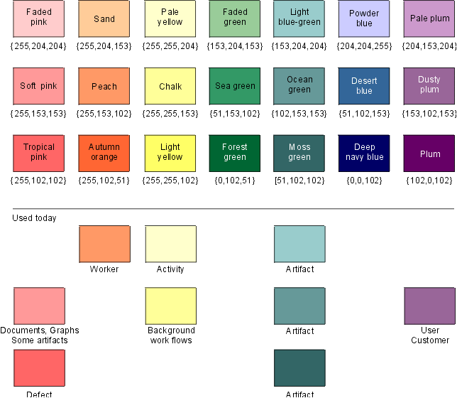
Using Colors
First of all: colors take up lots of space -- think twice before using it!
The web-browsers use 216 colors from what is known as the color cube. Using the RGB scheme, the 216 colors are made up from a triplet of {00, 51, 102, 153, 204, 255} (in hex that is {00, 33, 66, 99, cc, ff}). These are the ones already in CorelDraw's standard palette.
We use a subset of these colors to keep the online version colorwise harmonious. In the picture below, you see the colors in our subset, plus what they are used for. As you can see, we aren't using all of them yet. The names of the colors are indicated to help you choose the right ones in CorelDraw. The RGB value is also indicated.
There is a custom palette that you can use, with only the colors below included, plus black and white. Do as follows:
- Download the palette file rup_palette.cpl. You might want to save it in the Corel installation folder, where the pre-defined palette files are. (In Corel8, it's in the "Custom" folder.)
- In CorelDraw, right-click the Color Palette's border, and click Open.
- Choose the drive where the template is stored from the Look In list box. Color palettes have the extension .CPL.
- Double-click the folder where the file is stored.
- Double-click the palette's filename.
Tables
For headings in tables use style Normal.tableheading.
The theme rules that there should be no borders around tables. In fact, they are there, but they are white. If you really want visible borders, override with local settings.
Tables' placement:
- Centered in the text column.
Text alignment in cells
- Vertical alignment should be Top
- Horizontal alignment should be Default
References
A 'thing' is a 'worker', 'artifact', 'guideline', 'activity', etc. And a 'thing page' is a page with an activity, worker, artifact or guideline, etc.
Kind of references |
Examples |
Comment |
| To a 'thing page' | ...bla bla bla, see Activity: Find Use Cases and Actors. | Alt 1: In the text. |
| ...yada yada (see Guideline: Use Case), yada yada | Alt 2: In parenthesis. | |
| To a section in a 'thing page' | ...bla bla bla, see section "Timing" in Artifact: Software-Architecture Document. | Hyperlink to a page. The user is supposed to find the section. |
| Hyperlink references to a chapter in a manual. | ...yada yada yada, see section Overview in "Rational Unified Process - An Introduction". | The manual within quotation marks. |
| Non-hyperlink references. | ...yada yada yada, see section "Overview" in "Rational Unified Process - An Introduction". | The section within quotation marks, the manual in quotation marks. |
| In-text reference (preferred alternative) | ...Another technique is to perform role playing (see Role Playing), in which people act as business actors, business workers, and business entities. | |
| In-text reference (second alternative) |
...Another technique is to perform role playing, in which people act as business actors, business workers, and business entities. | Warning: Avoid this style of reference. |
General guidelines for cross-references:
- In the tables:
Create hyperlink to the thing with no prefix, such as Use Case.
Do not have the prefix, such as Artifact: Use Case. - Do not mention the process when we reference a "thing" in the process.
Write 'see Activity: Use-Case Analysis'.
Do not write 'see Rational Unified Process - Activity: Use-Case Analysis'. - Avoid referencing a bookmark in another page. Use the style above recommended for references "To a section in a page". This requires of course that the named section ( called "Timing" in the example) is visible on the page. Otherwise you may consider a reference to a bookmark. (There is also a problem that Microsoft FrontPage doesn't support bookmarks very well.)
Return and Shift-Return (Vertical White Space)
- A return means new paragraph, and in HTML you will get a <p>-tag or some other tag indicating a block of some sort. This is what you usually want.
- A shift-return will only insert a new-line in the current paragraph, and in HTML, a
<BR>-tag is inserted. The shift-return is useful when:
- a return gives you more vertical white-space than you want, in for example an outline description
- you want to control
where the line breaks in a bulleted list, or any paragraph for that matter
File naming
The current file naming convention uses the abbreviations in the table below, and an abbreviated name of the contents of the file, separated by an underscore. For example, the artifact Use-Case Model is called ar_ucm.htm, and the modeling guideline for the Use-Case Model is md_ucm.htm.
We are thinking of a different way of naming files, to accommodate the requirements of "unambiguous page referencing". Customers have expressed a need to be able to reference things in the process in an easy way, and it makes sense to use the same numbering or code in the filename (or at least some sort of obvious mapping).
| Concept | Abbreviation |
| concept | co_ |
| activity | ac_ |
| worker | wk_ |
| artifact | ar_ |
| report | re_ |
| workflow | wf_ |
| workflow introduction | int_ |
| workflow detail | wfs_ |
| workflow graph | wfsg_ |
| iteration workflow | iwf_ |
| guidelines (for models, model elements and artifacts) | md_ |
| work guidelines | wg_ |
| concept | co_ |
| configuration | cf_ |
| introduction | in_ |
| overview | ovu_ |
| requirements | req_ |
| analysis and design | and_ |
| implementation | impl_ |
| testing | test_ |
| deployment | depl_ |
| environment | env_ |
| introduction manual | im_ |
| project management | pm_ |
| rose users guide | rs_ |
| programming guidelines | pg_ |
Microsoft Word Template
There is a Microsoft« Word template for creating manuals for printing on paper. It is called rup.dot. A suggestions is to create a separate folder for Rational Unified Process Microsoft Word templates, for example named "RUP" in Microsoft Word's template folder (typically C:\Program Files\Microsoft Office\Templates) and place a copy of this template file, and others, there. For more information on using Microsoft Word see Working in Microsoft Word to find out how (not) to use Microsoft Word for HTML authoring, and the section Produce Manuals to find out how to create Microsoft Word manuals.
Index Online
See The Rational Unified Process Tools User Guide, for information on how to generate an index.
See the KeyWordIndex for more information on how to enter keywords into Rational Unified Process pages.